I have decided to create an exhibit that tells the story of my younger brother’s life surrounding his 1998 Cystic Fibrosis diagnosis. When Evan was diagnosed he was hospitalized for two weeks. In that two weeks his life changed dramatically and I want to create a visual representation of that change. “Cystic Fibrosis” can be very difficult for young children to say, one of the ways that the CF foundation came up with to help kids learn to say it, and in a way to make the concept of chronic illness seem less frightening, was by saying “Sixty Five Roses” instead. I want the theme of my exhibition to be literally 65 roses. I have been thinking about using a suitcase full of boxes that all have something in them surrounding my brother, CF, and the literal image of 65 roses. I’m still in the brainstorming phase but I think my end product will work out well.
Monday, November 30, 2009
Sunday, November 22, 2009
Creative Commons
I suppose that the idea of copyrighting my own work has always felt foreign and intangible to me. Legal documentation that I created something seems so far out of my league as an artists. Reading about the Creative Commons makes copyrighting seem so much more simple, and smart than I thought. My boyfriend is a songwriter going through some trouble with ex-band mates "stealing" his work. I am starting to think he should take a look at this CC thing!
I now realize that in today's world it doesn't really matter if you actually wrote the song, or drew the picture, or authored the book. Unless you have legal documentation proving that you created something someone can easily, and legally, claim ownership of it. That's kind of a depressing and scary thought. As for the sharing aspect of the CC, I think that is a totally new take on the idea of ownership and copyright. I believe that this is a good medium between having no copyright of one's work, and having a very solid copyright.
In the case of Sherrie Levine, if she had used CC to copyright her work I feel that it would have taken away from it’s meaning. I suppose that if she had done this then Michael Mandiberg probably wouldn’t have done his “After Sherrie Levine” work because his message would have been lost as well.
Monday, October 26, 2009
Icons in Persepolis

Cooley Gallery: The Language of the Nude
Spirit of the Times: Movie Posters
 "The Day The Earth Stood Still" (1955)
 The third poster that I found was for the 1971 film "Harold and Maude." Color photography had become more widely available by the mid to late 60's, so by the early 70's most movie posters were color photographs. The 70's are known for bright colors in photography, fashion, art, etc. Many household objects were quite kitschy around this time too. (ie. mushroom shaped cookie jars, salt and pepper shakers, etc.) In the movie poster for "Harold and Maude" there are several things that let the viewer know it was made in the 70's. First is the bright orange psychedelic-esque font which was very typical of the early to mid 70's. Second is the fact that the poster is simply a color photograph of the two main characters from the movie. Third is the wardrobe of the characters which is normal attire from the 70's.
 The last poster that I found that I believe is a good example of a movie that exemplifies the decade in which it was made is the poster for "Pretty in Pink" a John Hughes film from 1986. Again we see a photo of the character's from the movie dressed in attire that is very specific to the time period. The contrasted photo makes the characters look grungy. During this time the "grunge punk" music/fashion persona was a common sight, thus the poster shows us that the movie was made around the same time when that music and fashion scene was part of pop culture.
Monday, October 19, 2009
Image Hunt
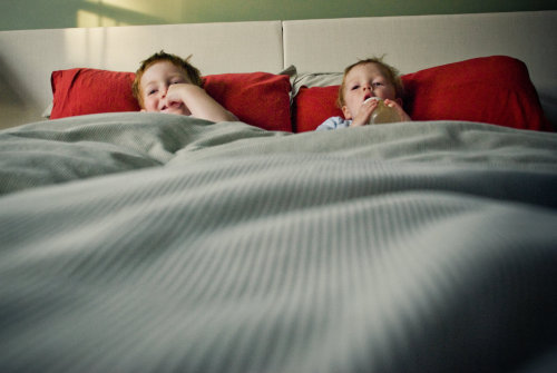
 "But in time we grew up, and seeking refuge in each other's beds became completely inexcusable."